
Key takeaways
- Embedded components are pre-built, brandable UI pieces for payment flows that drop into a platform’s app, sitting between hosted pages and building everything from scratch.
- They cover the full payment surface, from checkout and onboarding to dashboards, disputes, and refunds, so teams don’t rebuild what every payment platform needs.
- Theming makes them look native to the platform, and tokenization keeps sensitive card data (and PCI scope) off the platform’s servers.
- Platforms typically use components for standard flows and the API directly for anything they want to differentiate on.
- The approach scales across a platform’s growth, from launching fast to a mature mix of components and custom UI.
- Payabli Creator is Payabli’s embedded component library, with a broad catalog, native React components, deep theming, and API access underneath.
Every software platform adding payments has to solve the UX problem: what the payment form looks like, what happens when a card is declined, how a merchant sees their transactions, how a customer manages saved payment methods, how onboarding actually flows on screen.
The API problem (can we move money?) gets most of the engineering attention, but the UX problem is what merchants and end customers actually experience. Platforms that treat UX as an afterthought either ship payment flows that feel stitched-together, hurting conversion and trust, or spend disproportionate engineering time rebuilding surfaces that every payment platform needs.
Embedded components close this gap: pre-built, production-quality UI components for payment flows, designed to drop into a platform’s application and be themed to match its brand. They are the bridge between hosted (processor-provided pages the platform redirects to) and headless (API-only, platform builds every pixel), giving platforms ownership of the experience and speed to market at the same time.
The payment UX problem
The payment UX surface is larger than it looks. A full payments program has dozens of distinct UI moments:
- Onboarding and approval: application forms, KYB document upload, approval status screens
- Consumer payment: payment method entry, saved-card management, 3DS challenge flows, decline recovery
- Post-transaction: refund requests, dispute response forms
- Merchant dashboard: transaction dashboards, balance views, settlement history, statements
- Configuration: user management, API key management, webhook configuration, team settings
Each has to exist, be accessible, be mobile-responsive, and meet regulatory standards.
- The build cost. Building all of these from scratch is a team-year or more of UX and frontend work, before ongoing maintenance as the API evolves. Most platforms don’t have a team-year to spend on payment UX, and no merchant will consider anything better than what they have.
- The quality problem. Even teams with capacity often lack specialized knowledge. Payment forms have subtle requirements (card network icons, BIN detection, field masking, AVS/CVV flows, 3DS choreography, tokenization handoffs). Dispute flows have strict timing rules. Dashboards need to represent settled-vs-pending states correctly. Small mistakes here confuse merchants, and serious ones cost the platform business.
- The consistency problem. When every platform builds its own, merchants working across platforms see different flows on each, and end customers see different checkout behavior everywhere. The lack of convention creates friction.
- The maintenance problem. UX isn’t built once. Accessibility requirements evolve, new rules like Regulation II and state-level disclosures change what’s required, new payment methods need support, and new browser versions break things.
What are embedded components?
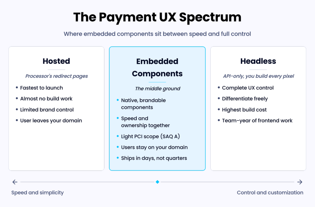
Embedded components are ready-made UI elements that each handle a specific payment flow, so a platform can drop them in and run them without building the interface from scratch. They drop into the platform’s application as first-class components, render natively, and are theme-able to the platform’s brand.
They communicate with the payments infrastructure behind the scenes, so the platform doesn’t implement API-level logic for each flow.
What makes them “embedded?”
They run inside the platform’s application rather than on a separate redirect page, so the flow never breaks out to a processor-hosted screen. The user’s experience stays on the platform’s domain, and the platform controls the surrounding page, navigation, and branding end to end.
What makes them different from iframes?
Classic iframe integrations give the platform a sealed black box it can’t style deeply, often with visible cross-domain signals that give away the third party underneath. Modern embedded components render as native UI elements with full theme control, real event handlers, and behavior indistinguishable from platform-built components.
The security model
Sensitive data (card numbers, bank account numbers) is captured directly by the component and tokenized before ever hitting the platform’s servers, so the platform never touches raw PCI data and keeps its obligations light.
In practice, most platforms qualify for the lightest compliance tier, SAQ A. This is the same security benefit as hosted-field iframes, without the visual compromise.
The update path
When the library updates (new accessibility features, payment methods, regulatory disclosures), the platform gets the changes via standard package upgrades. The UX evolves continuously without a rebuild, so the surface keeps pace with the payment landscape on its own.
The component catalog
A complete embedded component library typically covers the full payment surface. It breaks down across six areas:
- Consumer-facing payment entry: card entry fields, bank account (ACH) entry, saved payment method selectors, wallet connectors (Apple Pay, Google Pay), 3DS authentication handlers, tokenization and handoff, amount and fee display
- Merchant onboarding: business information forms, beneficial owner entry, KYB document upload, bank account verification, terms-of-service acceptance, application status views with step-by-step progress
- Merchant dashboard: transaction list with filtering, transaction detail views, settlement history, balance and funds-in-flight views, reports and statement generation, chart components for volume, trend, and cohort views
- Dispute management: dispute list and detail views, evidence upload, response submission forms, status tracking, deadline countdowns
- Refunds and voids: refund initiation forms with full vs. partial controls, void confirmations, transaction-level action menus
- Settings and configuration: user management, API key management, webhook configuration, bank account update flows, brand and tax information management
What to look for in a catalog
Coverage of the flows the platform actually needs comes first, followed by consistency across components (a family, not a grab bag) so nothing feels bolted on.
Accessibility (keyboard navigation, screen reader support, color contrast) and mobile responsiveness, by default, keep every component usable across users and devices.
Localization (languages, currencies, regional formats) and theming round it out, tying the set to the platform’s markets and brand.
Theming and brand control
Theming is how embedded components stop looking like someone else’s software and start looking like the platform’s own. Good libraries make that control layered:
Token-based theming
Good libraries expose theming as design tokens: colors, typography, spacing, border radii, shadows, and motion. The platform sets these values once, and every component reads from them, so a brand refresh propagates everywhere without per-component styling. This layer carries most of the visual work and keeps the payment UI in step with the rest of the product.
Component slot overrides
Beyond global tokens, some components expose slots where the platform injects its own content, a logo, a help link, or a vertical-specific instruction, while the component’s structure and behavior stay intact. Slots handle the cases where a platform needs to say something specific at a specific point in a flow, without forking the component or rebuilding it from scratch.
Full CSS override where needed
For the edge cases tokens and slots can’t reach, good libraries expose CSS custom properties or targeted style overrides. This is the escape hatch that aligns one stubborn detail with an existing design system without waiting on the vendor. Platforms rarely need it for everyday theming, but its presence means no visual requirement is ever a hard blocker.
What brand control enables
Layered together, these controls produce one continuous brand. Merchants and end customers see the platform’s identity across the entire payment surface, with no stray “Powered by” banners and no font or color seams between the platform’s own UI and the payment UI. The payment experience reads as part of the product, not as a third-party panel bolted onto it.
The strategic dimension
Brand control shapes who the merchant thinks they’re working with. A platform showing its brand through every payment moment owns the relationship. A platform deferring to the processor’s brand is perceived as a middleman. Embedded components let the platform claim the relationship without building the UX from scratch.
The developer experience
For the engineers integrating them, embedded components should behave like any other library in the stack:
- Installation: Standard package install via npm or equivalent. Imports work like any other React or Vue library, with no custom build steps.
- Initialization: A single initialization call with API keys and theming config at app bootstrap. Components reference the initialized context.
- Using a component: Import it, place it in the JSX, provide props (merchant ID, transaction ID, event handlers). The component renders, manages its own state, and fires events back.
- Event handling: Clear callbacks (onSuccess, onError, onProgress, onSubmit) let the platform react without inspecting internals.
- Testing: Components work in standard tools (Jest, React Testing Library, Cypress) and should have a test mode that renders without hitting production APIs.
- TypeScript support: Types for every prop, event, and return value, enabling autocomplete-driven development and catching errors before runtime.
- Documentation: Storybook or equivalent showing every component in every state, code examples for common patterns, and migration guides on version bumps.
Component vs. API decisions
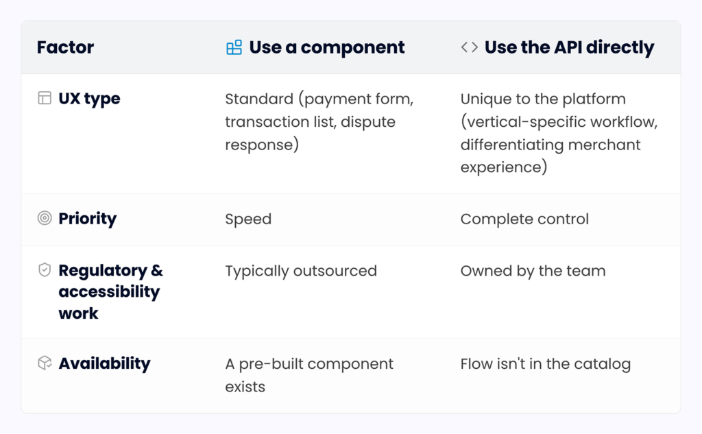
Components and direct API access aren’t an either/or. The question is per-surface: which flows deserve a pre-built component, and which deserve a custom UI.
The mixed approach
Most platforms use components for standard flows (dashboard, dispute management) and build custom UI on the API for vertical-specific flows. Speed where UX is a commodity, control where UX is differentiating.
The progression over time
Platforms often start with components for everything (crawl), then selectively build custom UI for flows that deserve it (walk), while keeping components for flows that don’t (run). The decision is per component.
What determines differentiation
Does the platform’s customer care about the specific UX here? If yes, custom is worth it. If no, and they rarely do for standard payment flows, components are the better call.
Compliance offloaded by default
The compliance dimension is what makes embedded components strategically valuable. Each area the library handles is one that the platform doesn’t.
PCI scope
Components tokenize payment data before it reaches the platform’s servers, so the platform never stores, transmits, or logs raw card numbers. PCI scope stays minimal (typically SAQ A).
Accessibility
WCAG 2.1 AA compliance is a legal requirement in many jurisdictions. Specialist-maintained libraries generally deliver it out of the box.
Regulatory disclosures
Certain flows require specific disclosures like Regulation E and Regulation Z, along with state rules. Good components maintain these as the landscape changes.
Security updates
When vulnerabilities surface (browser bugs, TLS weaknesses, XSS vectors), the library patches them, and platforms pick up the fix via a package upgrade.
Audit trail
Some components include built-in audit logging, simplifying compliance posture and supporting investigation.
The compound benefit
Every compliance item the library handles is one less item the platform’s compliance function tracks, adding up to meaningfully smaller compliance operations at equivalent posture.
Where components fit in crawl/ walk/ run
Embedded components aren’t a single-stage tool. They earn their place differently as a platform matures:
- Crawl. The fastest path from zero to a working payment UX. A platform can stand up a complete merchant-facing experience in days. Many crawl-stage platforms are 100% component-driven.
- Walk. Platforms customize, still using components for standard flows, building custom UI on the API for vertical-specific surfaces. The library becomes a foundation rather than the whole product.
- Run. A mix: some surfaces fully custom, some components, some components with slot overrides, each approach used where it fits best.
The transition path. A platform can move from 100% to 50% to 10% components as it matures, replacing one surface at a time. The transition is smooth because the API is always available beneath.
The thing that doesn’t change. Even run-stage platforms keep some components (refund modals, dispute response forms, bank account verification) because the ROI of rebuilding them is negative.
The failure mode of building it yourself
Building every payment surface in-house moves the work onto the platform’s own team. Platforms that take this route pay for it in five ways:
- The time tax: Roughly 6-12 months of frontend and UX engineering to reach feature parity, time not spent on differentiated features.
- The quality tax: Payment UX subtleties (BIN detection, 3DS choreography, decline recovery, dispute deadlines) trip up teams without payments experience.
- The maintenance tax: Accessibility standards evolve, payment methods appear, regulations change. A build-it-yourself UI requires ongoing investment, while component libraries amortize this across all users.
- The consistency tax: Different engineers building different surfaces at different times produce inconsistent UX.
- The opportunity cost: The highest cost is what the team could have built instead. Every hour spent rebuilding a dispute form is an hour not spent on the vertical-specific feature that differentiates the platform.
How Payabli Creator helps
Payabli Creator is Payabli’s embedded component library, designed as the walk-stage capability sitting on top of the same API that powers the rest of the Payabli stack:
- Broad component catalog. Coverage across the full surface: consumer payment entry, merchant onboarding and KYB, dashboards for transactions and settlements, dispute management, refund flows, user and API key management, bank account verification, and reporting views.
- Token-based theming with deep customization. A single set of design tokens drives colors, typography, spacing, and motion across every component, with slots and CSS custom properties for the rest.
- Native React components. These are true React elements rather than embedded frames, giving you real props, event handlers, DOM integration, and full testability.
- Security offloaded. Creator captures and tokenizes card and bank data at the point of entry, so the platform stays within a minimal PCI scope.
- Accessibility and regulatory compliance maintained. Maintained for WCAG, disclosures, and evolving payment methods, inherited automatically through upgrades.
- Full TypeScript support and documentation. Typed props and events, autocomplete-driven development, and Storybook-style previews.
- API beneath when needed. Platforms mix components and direct API calls in the same application without architectural tension.
Creator supports every crawl-walk-run stage: launch with 100% components and be production-ready in days, selectively replace standard components with custom vertical-specific UI at walk, and operate a sophisticated per-surface mix at run.
To get started with Payabli, book a free demo today.